


Key takeaways:
- Design your cover at 3000×3000 pixels to meet every platform’s requirements.
- Keep your art simple, readable, and high-contrast so it stands out, even at thumbnail size.
- Match your visuals to your show’s topic, tone, and audience for clarity and branding.
- Create cover art with an AI generator like Riverside’s Co-Creator, a design tool like Canva, or hire a professional.
Think of your podcast cover art as your show’s billboard. You want to make sure it stops the scroll, or listeners keep moving.
But where do you start?
I’ll walk you through every must-have detail, plus a step-by-step guide to creating podcast cover art that instantly grabs attention.
Podcast cover art checklist: 11 design principles for great cover art
Making podcast artwork is not as intimidating as it seems. Start with this video, then read on for tips and examples to make a great podcast cover.
1. Meet platform requirements
Your cover art must meet the technical specs required by major podcast directories. Failing to meet these rules can get your show rejected or make your art look broken.
Different directories have guidelines for image size, format, and quality. While there are some slight variations, most platforms follow Apple's lead.
Here are the 2026 specs for the major players:
Aspect ratio
All platforms require square images (1:1), even YouTube for its podcast-specific playlists.
Image size
Apple Podcasts recommends cover art 3000x3000 pixels.
Smaller images are accepted with a minimum of:
- 1400x1400 for Apple Podcasts
- 640 x 640 pixels for Spotify
- 1280 x 1280 pixels for YouTube
Using 3000x3000 px as a standard looks better and will satisfy all these platforms.
Color space
All platforms require an RGB picture with a resolution of 72 dpi.
File format
All platforms accept JPEG or PNG files.
- Spotify also accepts TIFF files.
- YouTube for podcasts also accepts GIFs.
- Apple Podcasts does not allow transparency or alpha channels.
Quality
All major directories specify that podcast artwork should not be blurry or pixelated.
File size
The maximum file size is usually 512 KB. But, large image files can slow down your RSS feed.
Aim for under about 500 KB if possible, by exporting to JPEG at ~80% quality rather than reducing size.
Explicit content
Images must not contain inappropriate content or explicit language and graphics.
If your show is explicit, mark it in your metadata. Don’t include badges or ratings text, and do not add an “Explicit” label.
Name
Most directories suggest that your artwork contains your show’s name in clear, large font.
Pro tip: To simplify my workflow, I design one master file with these "universal" specs saved: 3000 x 3000 pixels, 72 dpi, RGB color, no larger than 500 KB, saved as an 80% quality JPEG or a PNG (with transparency turned off).
2. Let your content lead the way
Your final cover art graphic should reflect your show’s:
- Topic
- Tone
- Personality
- Style
- Genre
Each genre has its own visual expectations, so start by researching your podcast niche to identify the most common design choices.
For example, horror podcasts often use dark, eerie art, while business podcasts are sleek and modern. These cues signal the theme to new listeners.
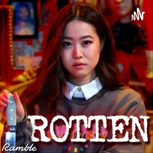
Look how Rotten Mango makes use of these cues: the blood red typical of the True Crime genre, and the host holding a knife.
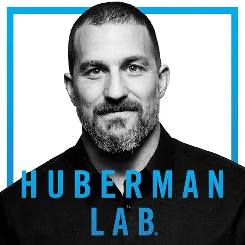
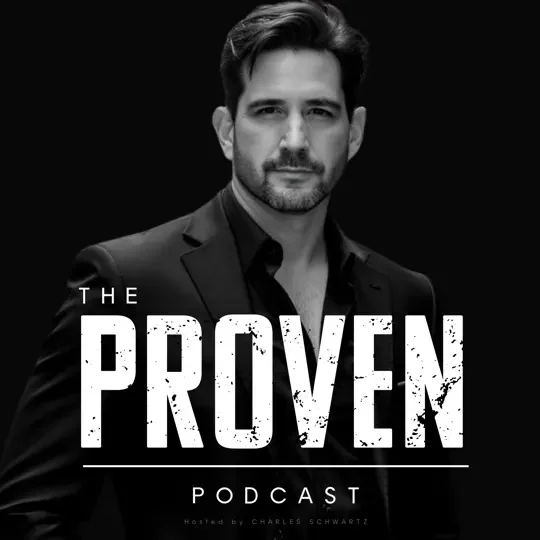
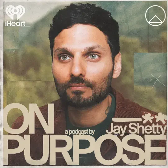
On the other hand, if the show centers on your personality, it makes sense to put your photo on the cover. For example, Huberman Lab’s main draw is its celebrity host, Dr. Andrew Huberman
If your podcast is about a specific hobby or industry, using related imagery can immediately signal that theme to browsing listeners.
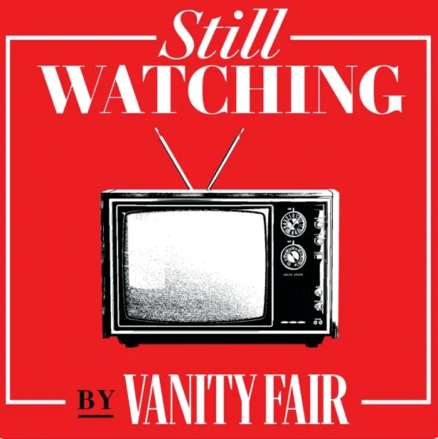
In Still Watching, the hosts discuss the latest popular TV phenomena, which is why an icon of a television set is the clear choice for the cover art.
Finally, your cover art must be consistent with your established brand colors and fonts. Its style must be easy to adapt for episode art, social media posts, and YouTube thumbnails.
Still undecided on your podcast name? Check our podcast name generator here!
3. Think about your audience
Take your target audience’s demographics into account when deciding on cover art. If you try to appeal to everybody, you may end up appealing to nobody.
A younger audience might feel attracted to bold colors and playful imagery, while a professional audience might prefer a clean, muted look.
Check how somber the artwork for The Markets, Goldman Sachs’ official finance podcast is, for example:
.webp)
Developing a detailed listener persona helps you customize your art for your ideal listener.
To develop your listener persona, answer the following questions:
- Who am I trying to attract?
- What is their age, gender, and occupation?
- What are their hobbies and interests?
- Why do they care about your podcast (what problem are you solving for them)?
Now imagine what kind of cover would make them click “play.” The more your artwork speaks to their preferences and the podcast’s topic, the more it will draw the right audience in.
Read more: Check our guide on how to start a podcast.
4. Less is more
Don’t make your podcast artwork too busy. A potential listener may only glance for a second or two while scrolling, so your cover must pop and be instantly clear.
My advice is to:
- Avoid information overload.
- Keep titles short and simple and with a clean font.
- Your title must be readable when shrunk to a 55x55 pixel thumbnail on a phone.
- Don’t put the episode number, host names, or other details in the art: you already got the episode title and show notes for them.
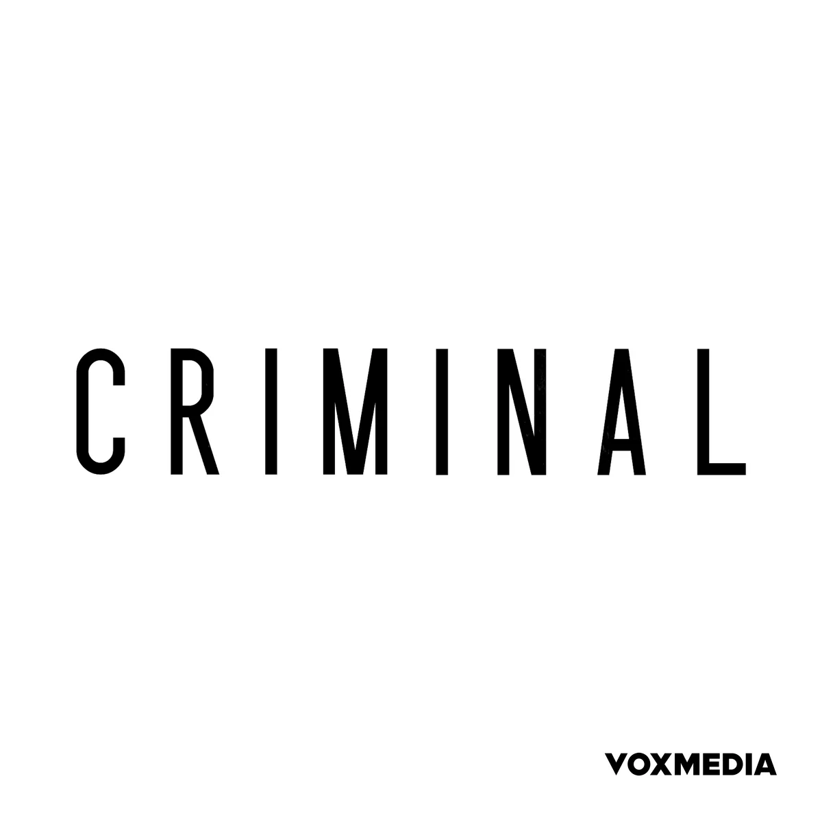
- Aim for 5 words or fewer. For example, look at Criminal, its one-word title on a white background is as simple as it could possibly be, yet it is instantly recognizable.
“You want to make sure that things are big and bold and have some sort of shock factor to stop people. Because often, they’re looking at this artwork from their mobile device or it’ll come through on their cas as they’re driving.” — Massimo Zefferino, Founder & Creative Director of zfactor
5. Make your cover scalable for different formats and sizes
Your art needs to work in all contexts, from a tiny thumbnail on your phone to a full-screen display. You might also want to repurpose the design for other uses, like episode covers, social media, or YouTube.
Some podcasters create a master show cover template and then derive episode-specific graphics from it. Just keep the core elements like your logo, title font, background, and colors consistent so your brand stays recognizable. Then swap in a guest photo or change the episode number on variant covers.
Here are a few of my tips for planning different types of art.
Show vs. episode covers
You have two types of art that do two different jobs:
Show cover
A show cover is the main artwork that represents your entire podcast. This means it should be simple, timeless, and attract new listeners who have never heard of you.
Episode cover
An episode cover is the art for an individual episode. It encourages audience retention and helps subscribers notice new content in their feed.
You can add a guest photo or an episode number, but keep the layout simple.
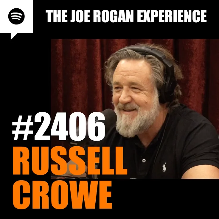
Just look at this example from Joe Rogan’s podcast:
Seasonal colorways and limited series
If your podcast runs in seasons or has special series, you can refresh the cover art slightly for each one.
Try changing only one or two elements of your design, like using different background colors. You could also add a small badge or text like “Season 2” if appropriate.
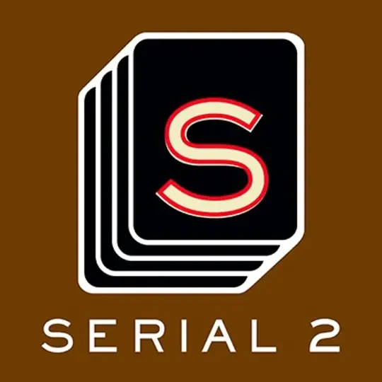
A good example is Serial, which keeps its simple layout but changes the background color and adds a season number.
Dark mode
Many people use podcast apps in dark mode, which makes very dark covers with no border blend into the UI. The opposite is also true if your cover is mostly white or light-colored and users prefer light mode.
I find the simplest solution is to include a thin border with colors that contrast with the main background.
6. Localization and internationalization
If you’re planning to release versions of your show in different languages, design your cover with localization in mind.
I suggest you:
- Favor imagery over text when possible since visuals don’t need translation.
- Use a short title that’s easier to translate or can be widely understood if left in English.
- Avoid using culturally specific icons or references that might not translate well. What’s obvious in one country could be confusing or even offensive in another.
- Ensure your podcast metadata, like your title and description, is translated. On your website, use alt text for the cover image so that screen readers can describe it.
7. Go for compatible color contrasts
The color wheel is an easy way to come up with color combinations that sell subtle messages to your audience.
Here are a few color contrasts to try:
Analogous colors
Traditionally, great choices are to choose colors right next to each other on the color wheel, otherwise known as analogous colors.
These colors together often signify harmony or cohesion, and can often inspire trust. Formal or business podcasts often choose analogous colors for their cover art.
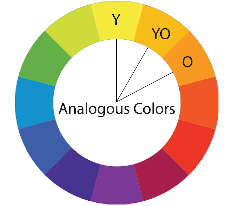
For instance, The Daily incorporates blue, green, and yellow to appear both calming and mature. And it doesn’t hurt that these colors evoke a sunrise, which matches the morning news show’s topic.

Complimentary colors
Complementary colors are directly across from each other on the color wheel.
They create a strong, appealing contrast that really pops and catches the eye. Podcasts with vibrant or loud personalities might choose a complementary color pair.

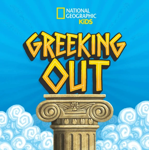
The National Geographic kids’ show Geeking Out uses blue and orange to pop and appear fun and vibrant to its target audience.
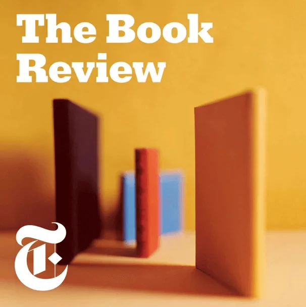
Triadic colors
Colors on an equilateral triangle are known as triadic colors.
They’re great for complex logos or graphics, as these three colors are visually distinct yet complementary.
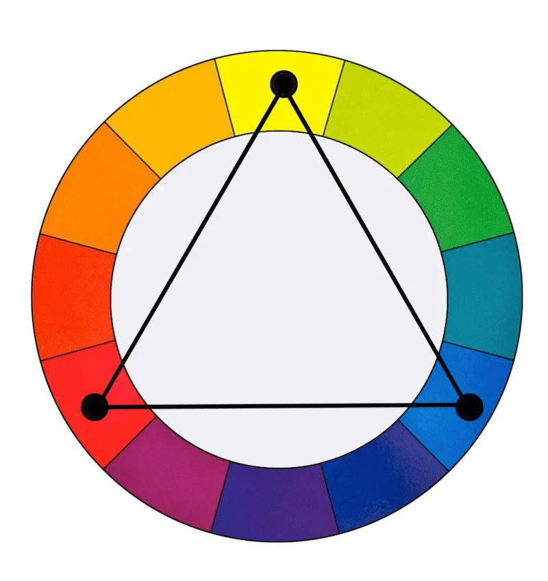
The Book Review from The New York Times uses reds, yellows, and blues to create a complex image with multiple focus points while still seeming put-together and cohesive.
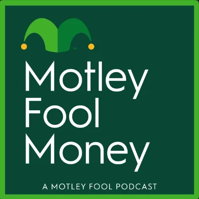
Color temperature
Color temperature also matters. According to color theory, each color represents specific emotions and psychological states of being.
Warm colors like red signify energy and action. This is why you’ll see red in true crime or horror shows. It evokes passion, love, or even anger.
On the other hand, green is a cool color that signifies nature, renewal, and abundance or wealth. This is why green works for the cover art of finance podcasts like The Motley Fool.
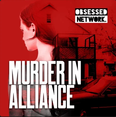
8. Keep in mind layout, spacing, and safe margins
Proper spacing keeps your cover art polished and prevents important elements from getting cut off on screen.
Give all elements of your layout a bit of breathing room from the edges. I suggest at least 10-12% of the image width in pixels.
Note how Murder in Alliance keeps a wide margin to ensure the main elements are not obscured.
9. Keep legalities in check
Legal aspects are the most critical and often overlooked part of podcast cover art design. A mistake here can lead to serious legal troubles!
In a nutshell, ensure you have the rights to everything on that image.
Focus on:
Trademarks
Do not use any registered trademarked images or logos in your art, for example, a Disney character or the Nike swoosh, unless you have written permission.
Right of publicity
Do not put a guest's face on your main show cover art without a signed contract. Using it for episode-specific art is more acceptable as it's editorial for that episode.
Stock photos
You cannot use any image from Google. You must have a commercial license.
Be wary of false "free" stock sites, and note that "Editorial use only" images are forbidden for commercial use, like a podcast cover.
Font licensing
This is a hidden trap. A "free" font from a random website is often only "free for personal use". You need a clear commercial license for your podcast art.
The safest bet is to use fonts from Google Fonts or, if you have a Creative Cloud subscription, Adobe Fonts.
AI-generated images
Art purely generated by an AI (e.g., from a text-to-image prompt) is not eligible for copyright protection because it lacks human authorship.
Always consider AI-generated art as a draft to refine to make it yours.
Beware of the outputs too. Some AI art may inadvertently copy styles or elements from copyrighted works in its training data.
10. Choose high-resolution images
Always use high-quality source files. You can scale a 3000x3000px image down, but you can’t scale a small, blurry 600x600px image up without it looking terrible.
Keeping file size as small as possible is a good practice. With image compression, you can easily save a high-quality 3000x3000px JPG that’s well below 500KB.
11. Measure your cover’s impact
A/B testing different designs of your cover art shows you what performs best. But be careful. Massive changes can cause existing listeners to no longer recognize the show in their feeds.
If you plan to rebrand, just warn your audience ahead of time on social media and in your episodes and ask their feedback with a poll.
How to make a podcast cover: 3 methods
Now that you’re full of ideas for your podcast, it’s time to bring that cover art to life! There are several ways to create it, so let’s explore the most common methods.
Using an AI podcast cover generator (like Co-Creator)
If you’re not a designer and want to create podcast cover art quickly, one of the fastest ways is to use an AI generator like Riverside’s Co-Creator. Generate cover art (and other assets) by simply describing what you want.
The best part is that Co-Creator is built directly into your recording and editing workflow. Unlike a generic image generator, it understands your actual content.
Here’s how to use it step-by-step:
Step 1: Log in on Riverside and from your Projects page, select one of your podcast episodes.
Step 2: Click on the “Edit” button right below the video to jump inside the Editor.
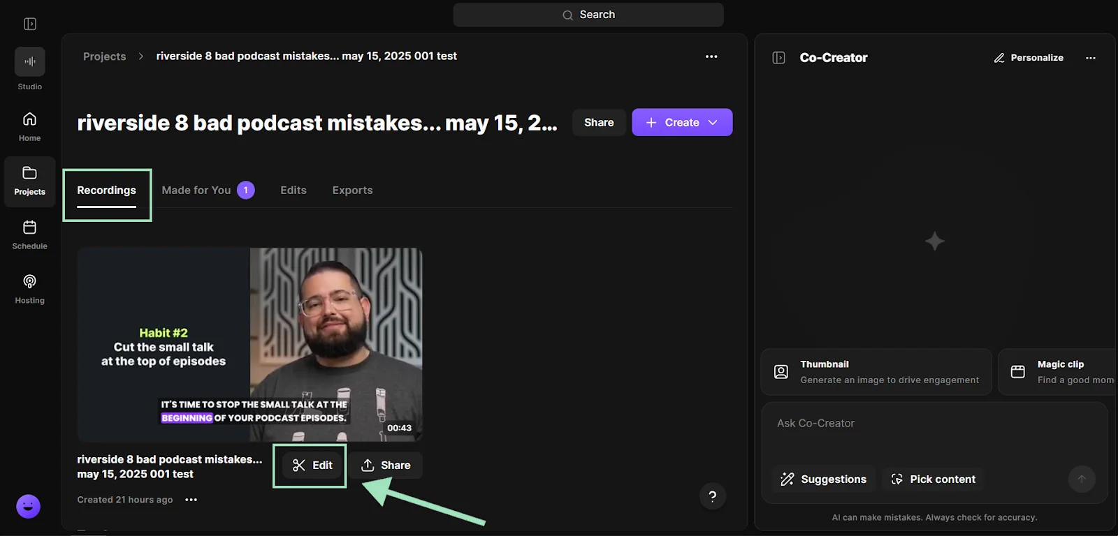
Step 3: Click on the “Co-Creator” button on the upper right corner to open Co-Creator.
.webp)
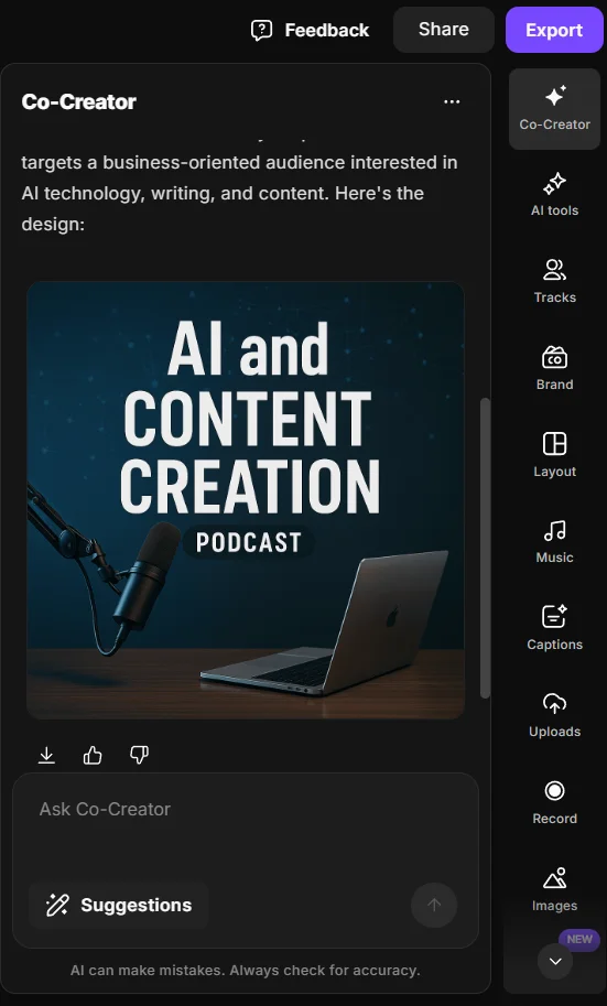
Step 4: To generate a podcast cover art for your show, just tell Co-Creator what to do with a simple prompt. You can describe it, mention your target audience and genre, and use your own recordings as a reference.
For example: “Generate the cover art for my podcast about the future of AI in SaaS. It should target a business-oriented audience, age 40-55, and their interests include writing, technology, and content creation.”
Once it’s ready, you can further refine it, or be more specific about text on the image, the colors, or any other detail you like.
You can also use Co-Creator to generate many other promotional assets for your podcast, like thumbnails, promo videos, blog posts, snippets, and more. All you need to do is ask it by chatting!
Using graphic design tools
Designing your cover art yourself requires more time and effort, but it gives you full control.
Tools like Canva or Adobe Express offer many templates, making it easier to create podcast cover art with no prior experience. All you need is a small budget and some time to experiment. If you have a clear vision and enjoy tweaking designs, you can precisely implement your ideas in 2-3 hours.
Unlike AI-generated content, there’s also no ambiguity about rights. But you must still use properly licensed images and fonts.
The drawback is there can be a learning curve. While it’s easy to make something that technically meets the requirements, it may still look unpolished. After all, doing it yourself means the quality is on you!
Here are some of our favorite free podcast templates in Canva:
- Modern playful music
- Black and white vintage science
- Dark modern night story
- Yellow woman portraits arts & culture
- Green greyscale portraits health & wellness
Hiring a designer to create your podcast cover
The most “hands-off” solution for you is to bring in a graphic designer.
An experienced professional can craft a custom cover that aligns with your branding and vision. This is the best option if you have an established brand, less time, or enough budget.
Look for a freelancer on Upwork and Fiverr. Or, hire a design firm or marketing agency. You can run a design contest on 99designs.
A budget freelancer might charge $15-$75. Meanwhile, a professional designer or agency charges from $200 to $2,000+ for a full package. (This includes podcast logo, cover art, templates, and often more). Don’t be cheap, though: you get what you pay for.
Podcast cover art ideas by genre with examples
Every podcast genre has its own visual cues, design elements that instantly tell listeners what kind of show they’re looking at.
Use the examples below for inspiration, but don’t feel like you have to follow the crowd!
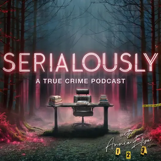
True crime
- Visuals: Dark, moody, and gritty. Often use textures like maps, newspaper clippings, or evidence tags. Photography can add a sense of "realness" to the story.
- Fonts: Heavy, condensed sans-serif or stencil-style fonts.
- Colors: Muted, dark palettes with a single, high-contrast accent color like red or orange to create tension.
- Psychology: This style cues "serious," "investigative," and "unsettling," perfectly matching the genre's tone.
Comedy and pop culture
- Visuals: Bright, playful, and often illustrative or character-based. Face-centric designs with exaggerated expressions are common.
- Fonts: Bubble, rounded, or bold sans-serif fonts that feel fun and informal.
- Colors: Vibrant, high-saturation color blocks. Think punchy and "casual".
- Psychology: This style feels energetic, informal, and approachable. The bright colors are designed to be "scroll-stopping".
Business and tech
- Visuals: Minimalist, clean, and geometric. Often incorporates the company's existing logo or uses abstract data iconography.
- Fonts: Clean, modern, and professional sans-serif fonts.
- Colors: Typically follows a professional, 2-color brand palette. Less is more.
- Psychology: Minimalism communicates confidence, professionalism, and "quiet luxury". It reduces cognitive load and implies the content is high-value and doesn't need to "shout" with flashy graphics.
Health, wellness, and education
- Visuals: Often features a professional, approachable photo of the host to build trust and authority (e.g., Huberman Lab). Can also be abstract, using simple icons and soft gradients.
- Fonts: Clear, simple, and often lighter-weight sans-serifs that are easy to read.
- Colors: Soft, calming palettes (light blues, greens, earth tones). Uses generous white space to "reduce visual noise" and feel uncluttered.
- Psychology: This style feels trustworthy, calm, and authoritative. The host's face builds a parasocial connection, which is key for a wellness-based show.
Frequently asked questions on podcast cover art (FAQs)
What size should podcast cover art be?
Use a 3000x3000 pixel square (1:1) JPEG or PNG image in high resolution. Apple Podcasts and most major platforms recommend this size for best quality, but even smaller formats like 1400×1400 pixels are accepted. The image should be 72 DPI in RGB color with no transparency. Make sure you keep file size under 512KB.
Can I change my podcast cover art after publishing?
Yes. You can change your cover art at any time by uploading the new file to your podcast host, not to Apple or Spotify directly. Your host will update your RSS feed, and the change will be automatically updated within 24-48 hours.
To speed up the process, ensure your new image file has a different filename than the old one. It’s also wise to announce the change to your audience, and update your website, social media banners, etc., with the new artwork for consistency.
Should my cover include text or just an image?
It’s strongly recommended to include text on your podcast cover. A short, legible title (2-4 words) is essential for discoverability and probably is the most important part of the art. If the name isn’t there, people might not remember it or know what your show is about at a glance.
Where can I find podcast cover art examples for inspiration?
The best place is to browse the top charts in your specific genre on Apple Podcasts and Spotify. Screenshot or save the covers that catch your eye, then analyze why they work (color, font, imagery). Do not copy them, but use them as inspiration for your own unique design.
Are AI podcast cover art generators safe to use?
Reputable AI image tools like Riverside’s Co-Creator often grant you rights to use the images they generate. However, always check the terms of service.
Keep in mind that purely AI-generated images are generally not eligible for copyright protection, so always add or refine the text manually after you get the first draft.
Lastly, avoid prompting the AI to create images of trademarked things or real people, like “generate a Star Wars themed cover.” Doing so could lead to outputs that inadvertently include copyrighted or recognizable elements, which could be risky to use.
How do I create podcast cover art for free?
You can use the free tier of a design tool like Canva or Adobe Express. The free version of Canva or Adobe Express come with hundreds of thousands of free photos and graphics, cover art templates, and design types.
Start with a 3000x3000 pixel canvas and use their built-in podcast templates. Then use free assets like Google Fonts and commercially-licensed stock images.
Also, if you’re already paying for a Riverside account to record and edit your podcast, you can use Co-Creator for free!


.webp)


